Core Visual Identities & Scalable Brand Architecture
A dedicated case study focusing on the strategic naming, typography exploration, and logo development for ANA's enterprise product lines and digital media platforms. This project highlights the complete visual evolution from raw initial sketches and former concepts to refined, production-ready final assets.
Role & Scope
Led the brand identity development across both projects, spanning early brainstorming, wordmark sketching, icon structure exploration, and visual system refinement.
Led the brand identity development across both projects, spanning early brainstorming, wordmark sketching, icon structure exploration, and visual system refinement.
Tools
Adobe Illustrator and Photoshop.
Adobe Illustrator and Photoshop.
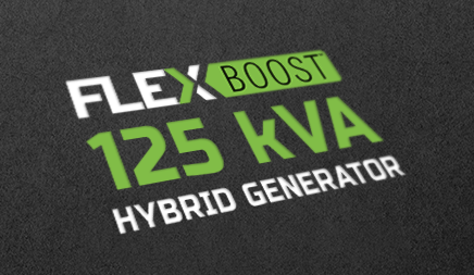
01 / FLEXBoost™ Brand Identity
Trademarked Logo Development & Process Thinking
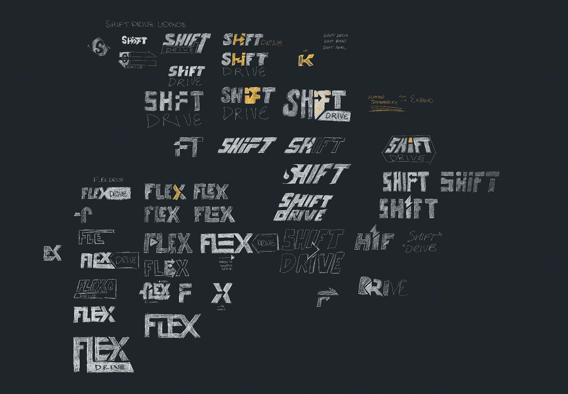
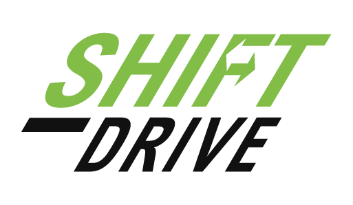
The FLEXBoost™ identity evolved through multiple naming and branding explorations before the final product positioning was established. Early concepts explored alternative directions such as "Shift Drive," focusing on adaptive energy, intelligent power response, and generator optimization. These explorations helped shape the foundation for the final visual system.
Trademarked Logo Development & Process Thinking
The FLEXBoost™ identity evolved through multiple naming and branding explorations before the final product positioning was established. Early concepts explored alternative directions such as "Shift Drive," focusing on adaptive energy, intelligent power response, and generator optimization. These explorations helped shape the foundation for the final visual system.
Identity Evolution & Refinement
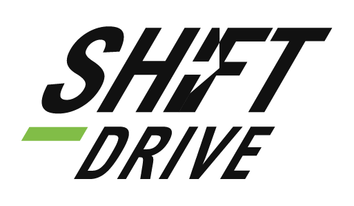
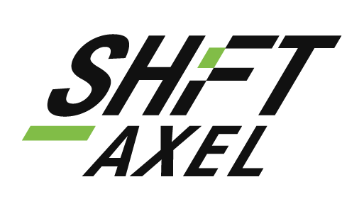
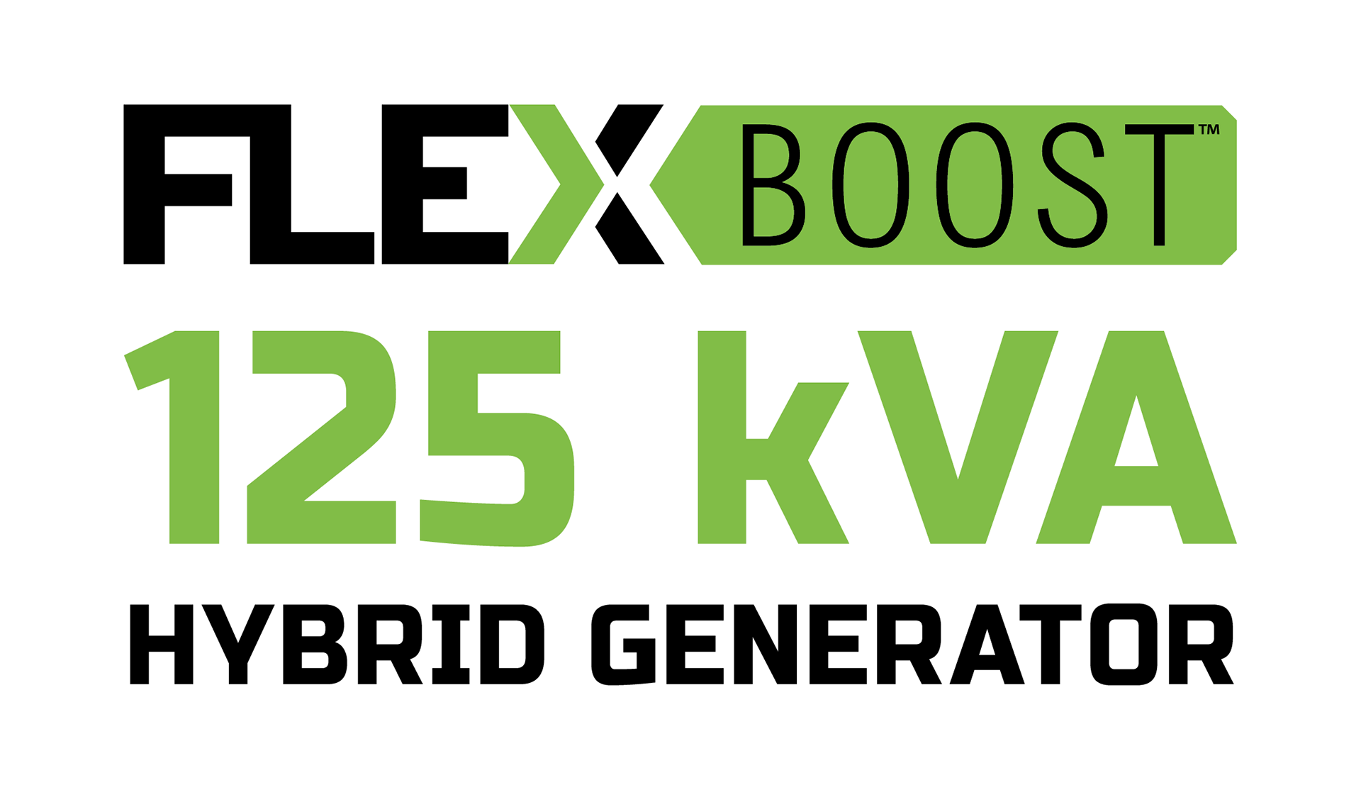
As the product strategy matured, the branding evolved into FLEXBoost™ to better communicate flexibility, amplified performance, and real-world adaptability. While early concepts focused primarily on intelligent energy shifting, the final identity expanded the positioning into a broader adaptive power platform.
As the product strategy matured, the branding evolved into FLEXBoost™ to better communicate flexibility, amplified performance, and real-world adaptability. While early concepts focused primarily on intelligent energy shifting, the final identity expanded the positioning into a broader adaptive power platform.
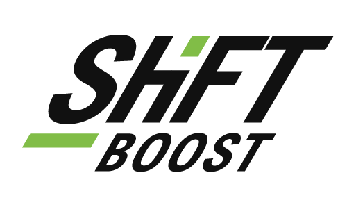
The Approved Final Mark
The final identity system combined bold industrial typography with a highlighted "BOOST™" treatment designed to reinforce adaptive power performance and scalable generator technology.
The final identity system combined bold industrial typography with a highlighted "BOOST™" treatment designed to reinforce adaptive power performance and scalable generator technology.
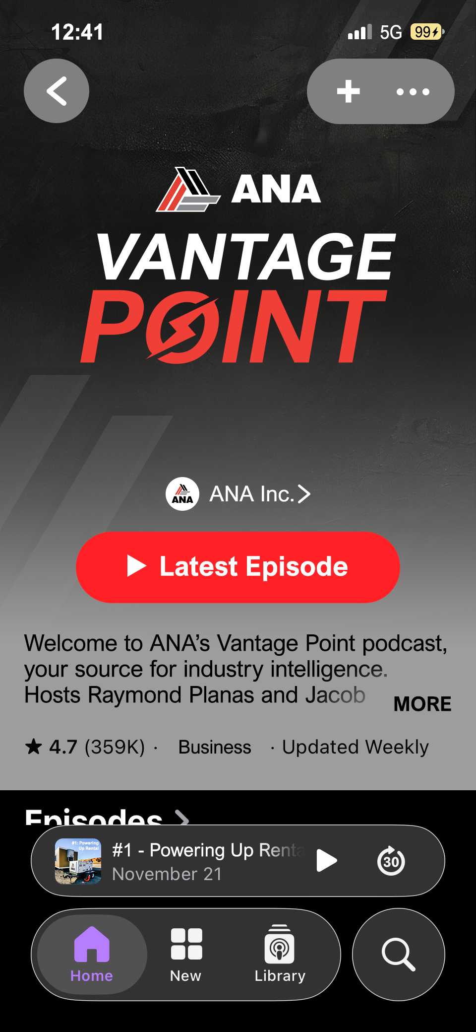
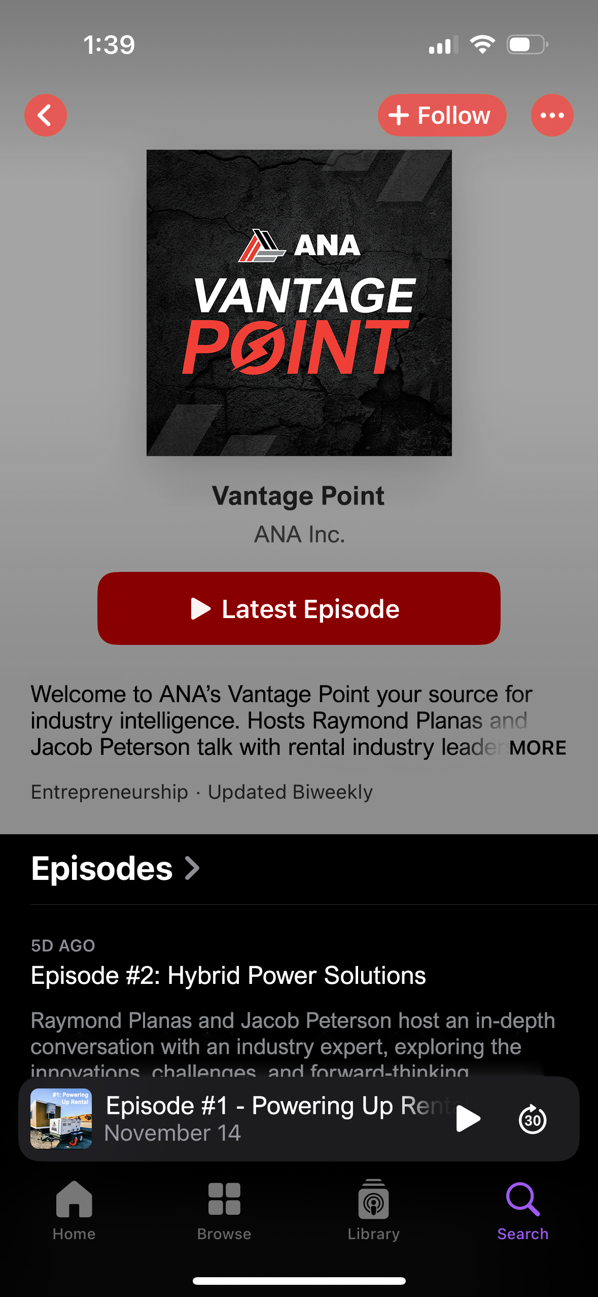
02 / ANA Vantage Point Brand Identity
Strategic Exploration & Ecosystem Naming
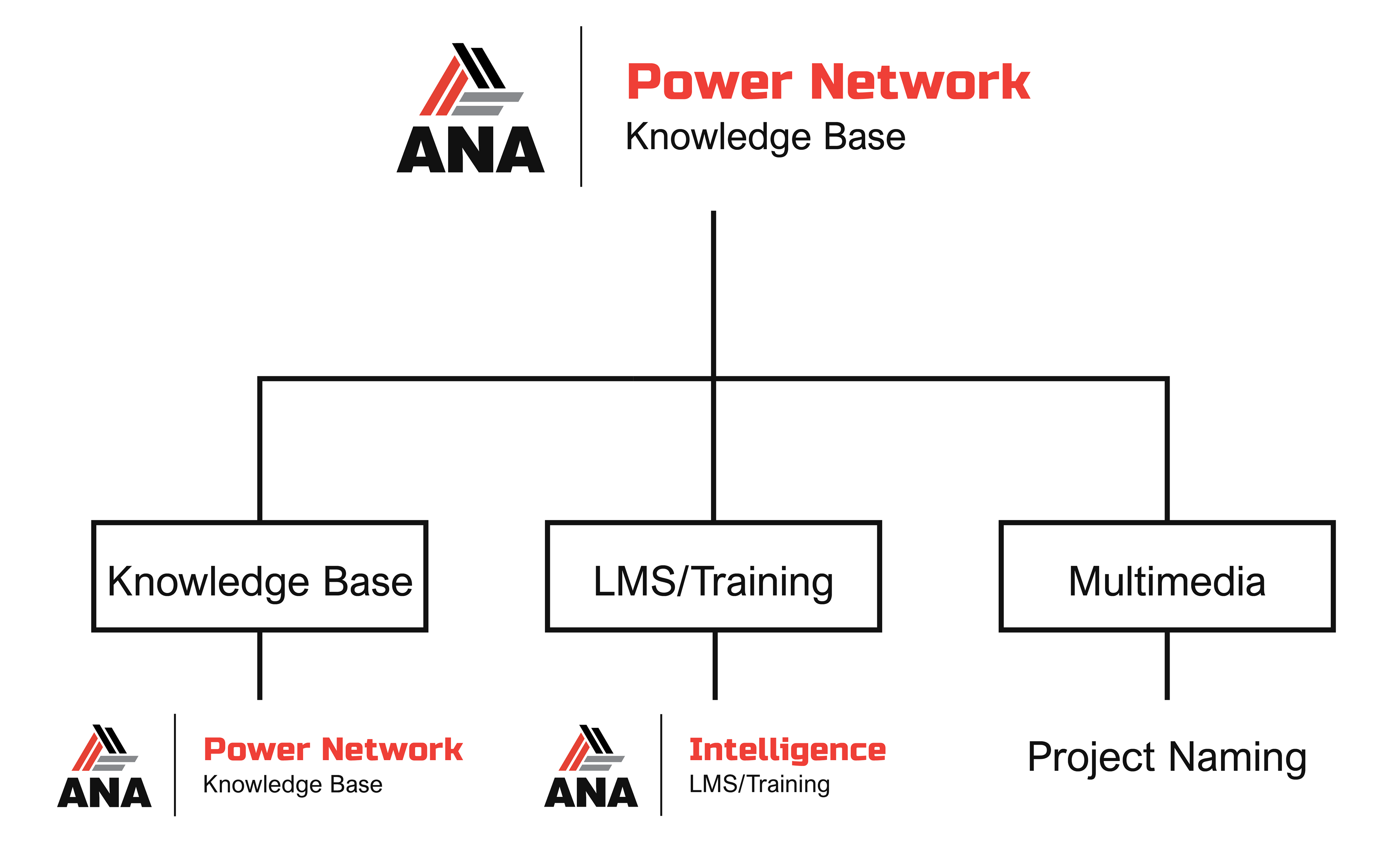
ANA Vantage Point began as an exploration into how ANA could unify educational content, multimedia communication, and knowledge delivery under a scalable branded system. Early exploration focused on building a scalable naming and identity framework capable of supporting multiple forms of content delivery across ANA's growing educational ecosystem.
Strategic Exploration & Ecosystem Naming
ANA Vantage Point began as an exploration into how ANA could unify educational content, multimedia communication, and knowledge delivery under a scalable branded system. Early exploration focused on building a scalable naming and identity framework capable of supporting multiple forms of content delivery across ANA's growing educational ecosystem.
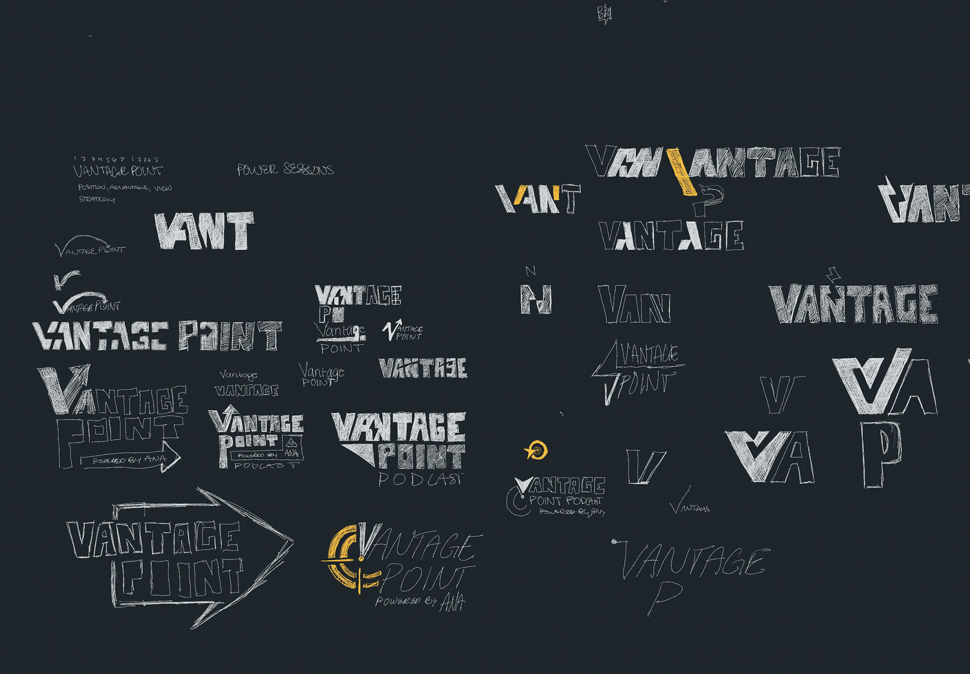
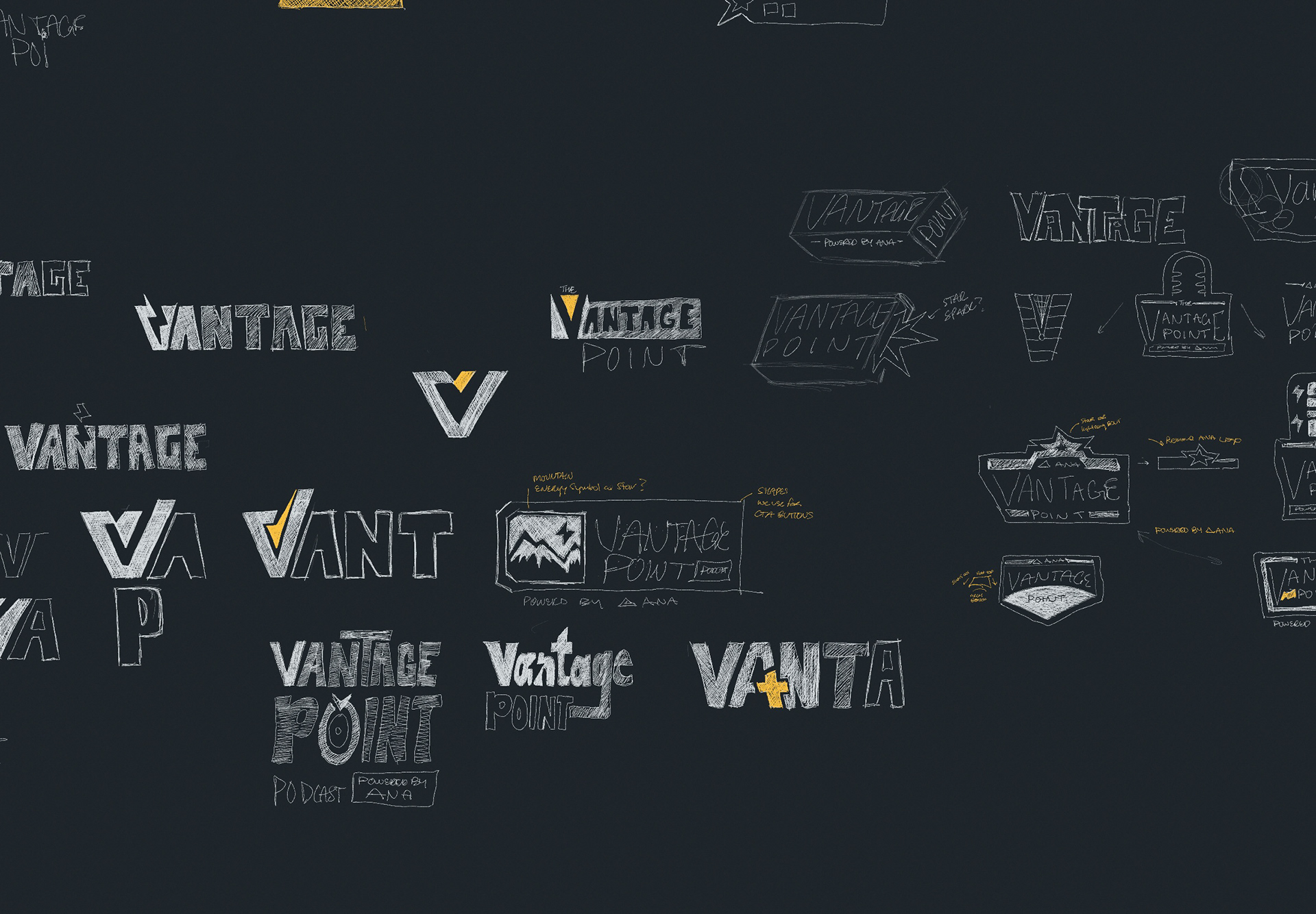
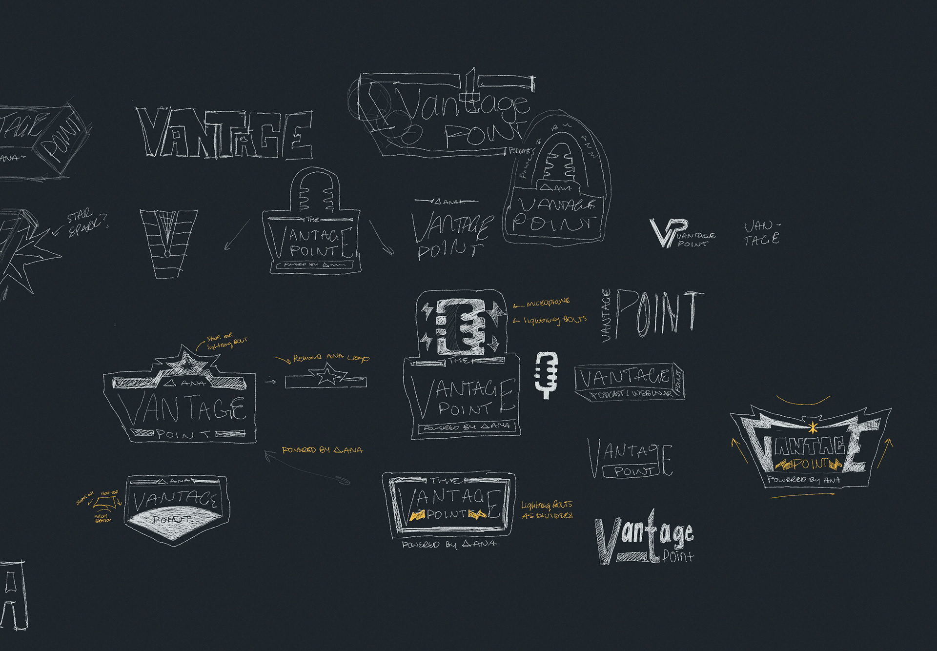
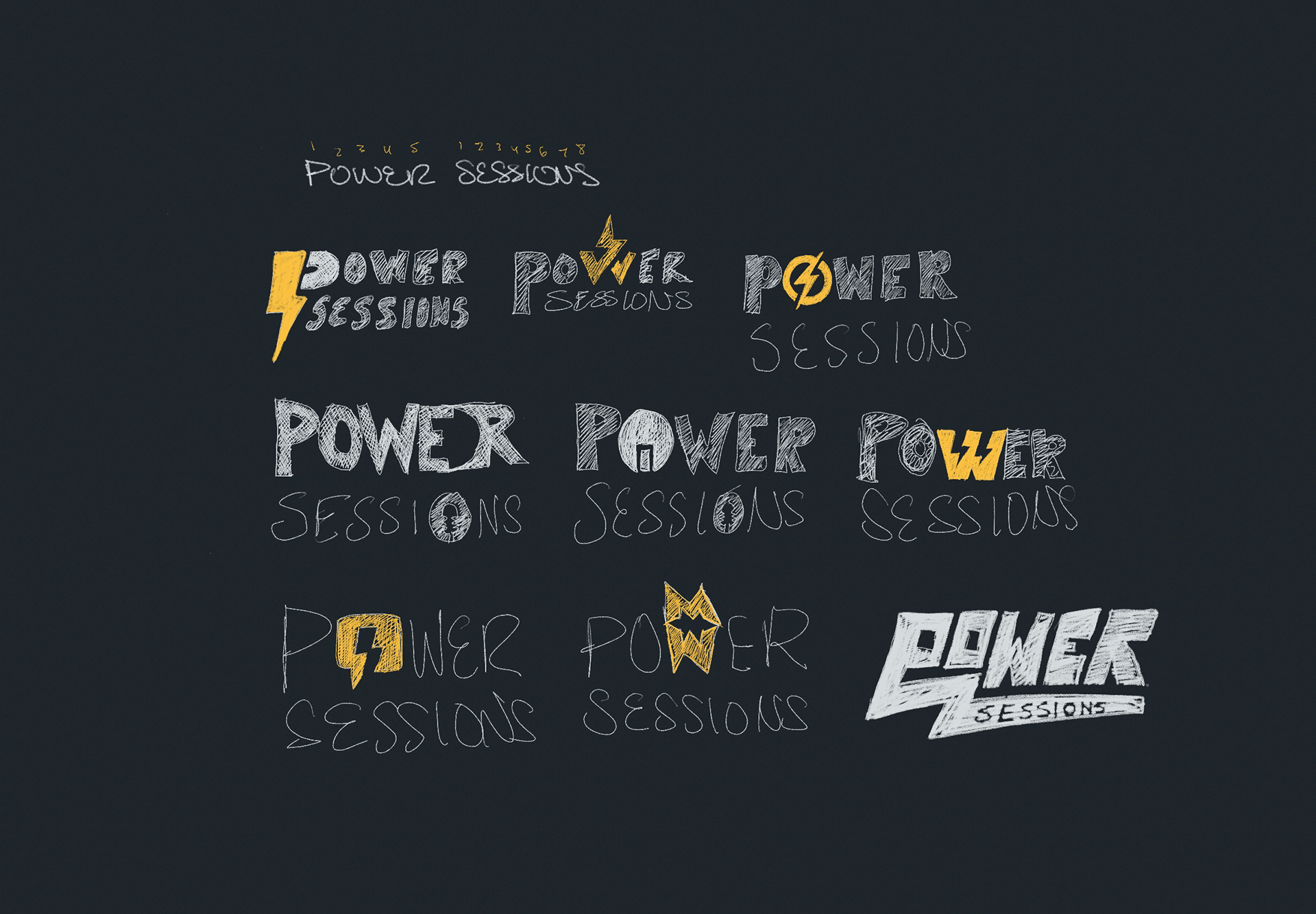
Identity Exploration & Process Sketches
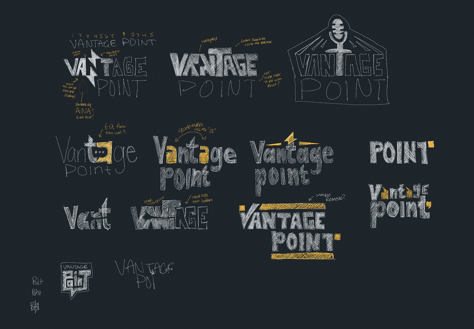
The visual development process explored a wide range of typography systems, icon structures, naming conventions, and graphic behaviors before arriving at the final direction. Rather than immediately refining a single logo, the process prioritized experimentation and scalability to better understand how the identity could evolve across multiple content formats.
The visual development process explored a wide range of typography systems, icon structures, naming conventions, and graphic behaviors before arriving at the final direction. Rather than immediately refining a single logo, the process prioritized experimentation and scalability to better understand how the identity could evolve across multiple content formats.
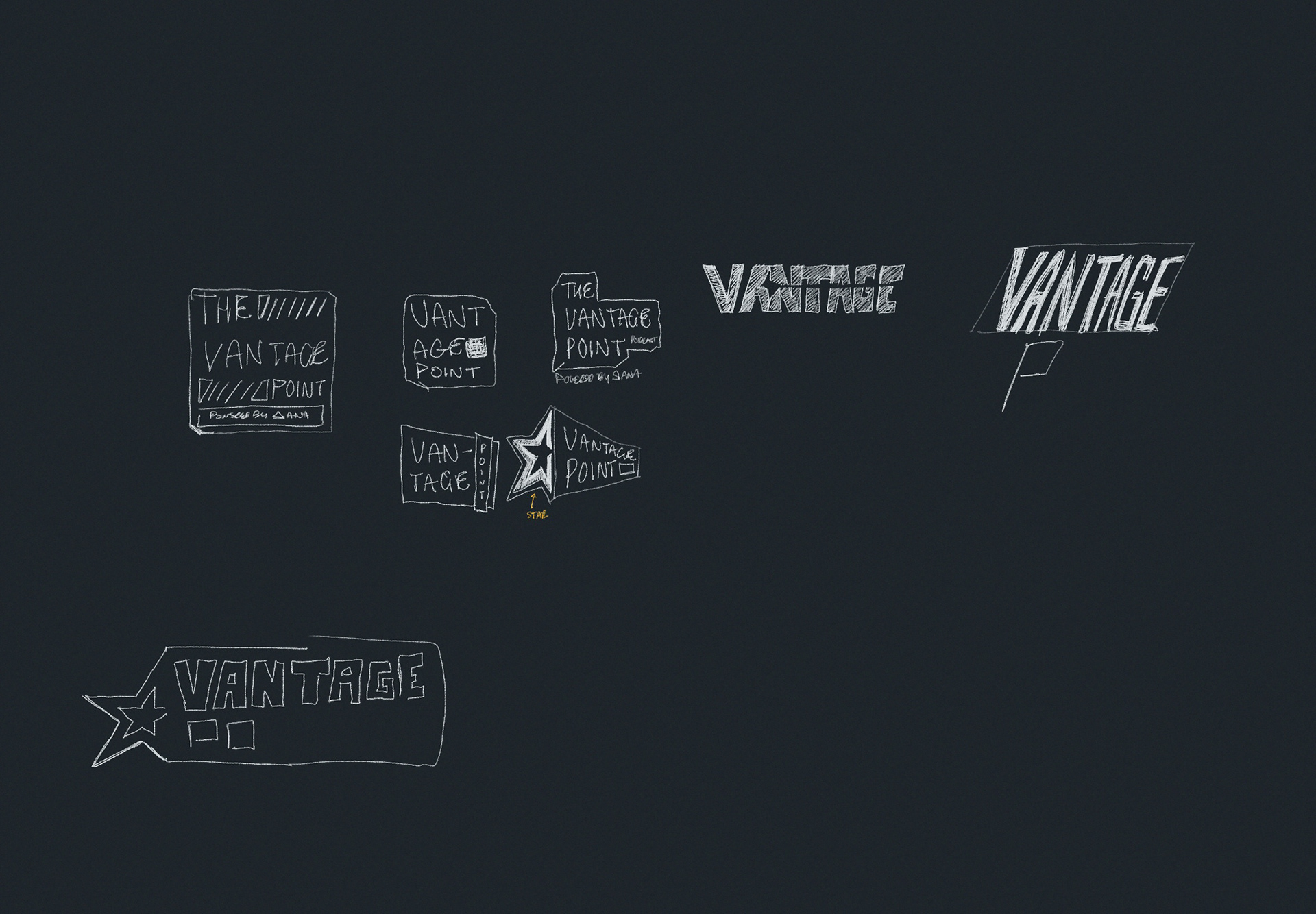
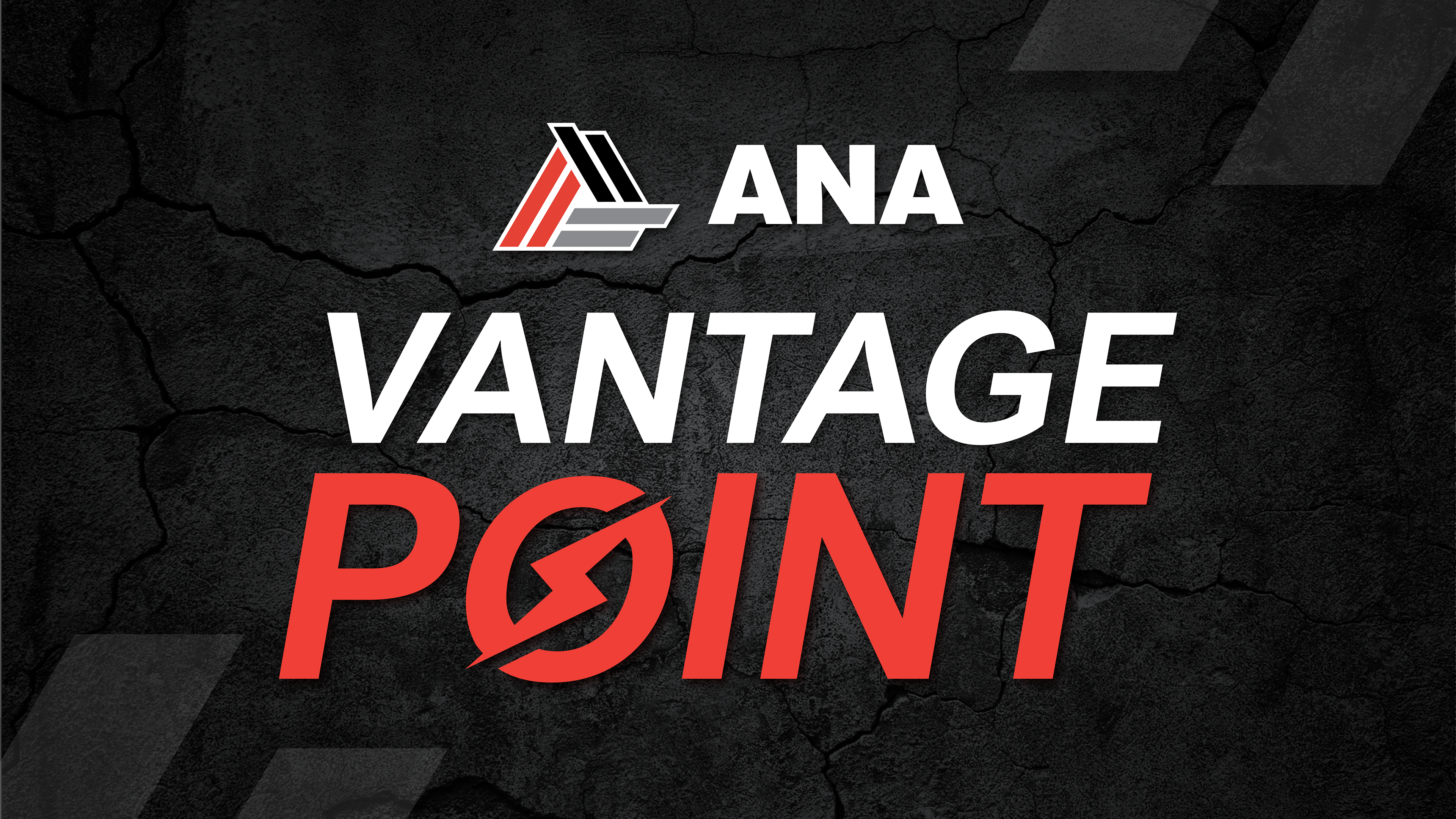
Refining the Final Direction
As the project matured, the focus shifted away from a large-scale ecosystem rollout and toward establishing a clear, recognizable flagship identity for ANA's podcast and webinar initiatives. The final direction condensed many of the earlier strategic ideas into a simplified, scalable brand mark capable of performing effectively across digital platforms and media applications. The approved identity balances technical credibility, bold visibility, and platform adaptability.
As the project matured, the focus shifted away from a large-scale ecosystem rollout and toward establishing a clear, recognizable flagship identity for ANA's podcast and webinar initiatives. The final direction condensed many of the earlier strategic ideas into a simplified, scalable brand mark capable of performing effectively across digital platforms and media applications. The approved identity balances technical credibility, bold visibility, and platform adaptability.
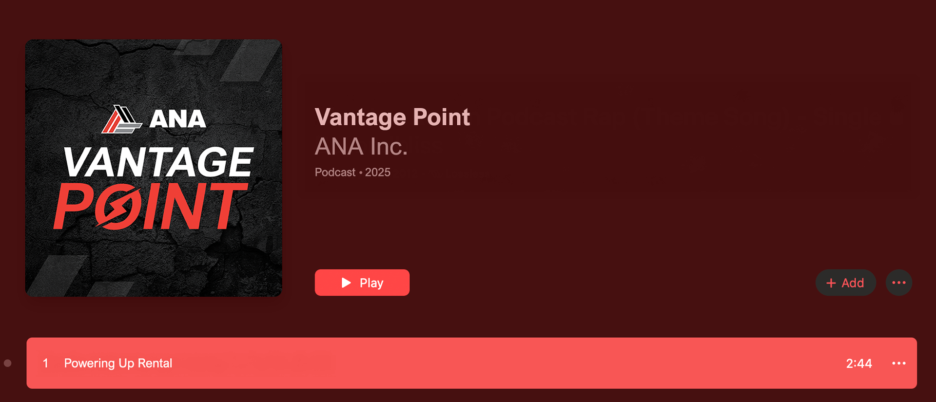
Apple Music- Desktop
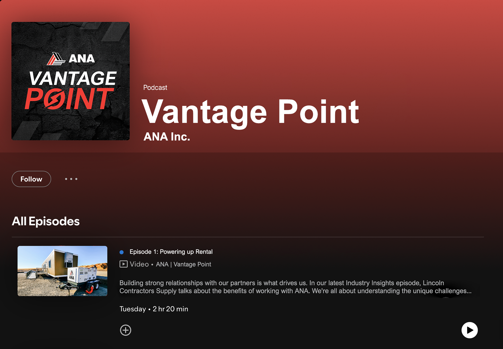
Spotify - Desktop
Apple Music - Mobile
Spotify - Mobile
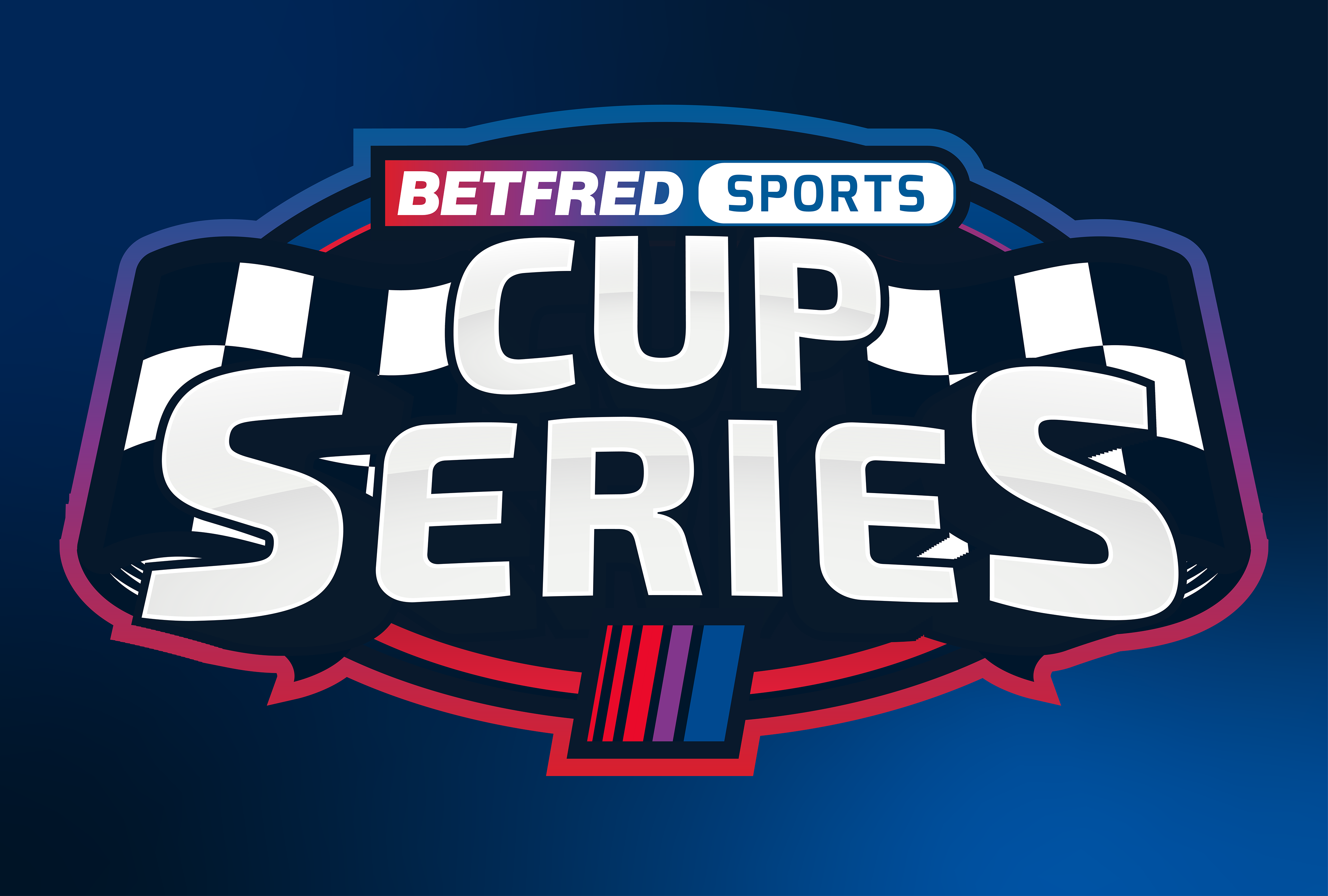
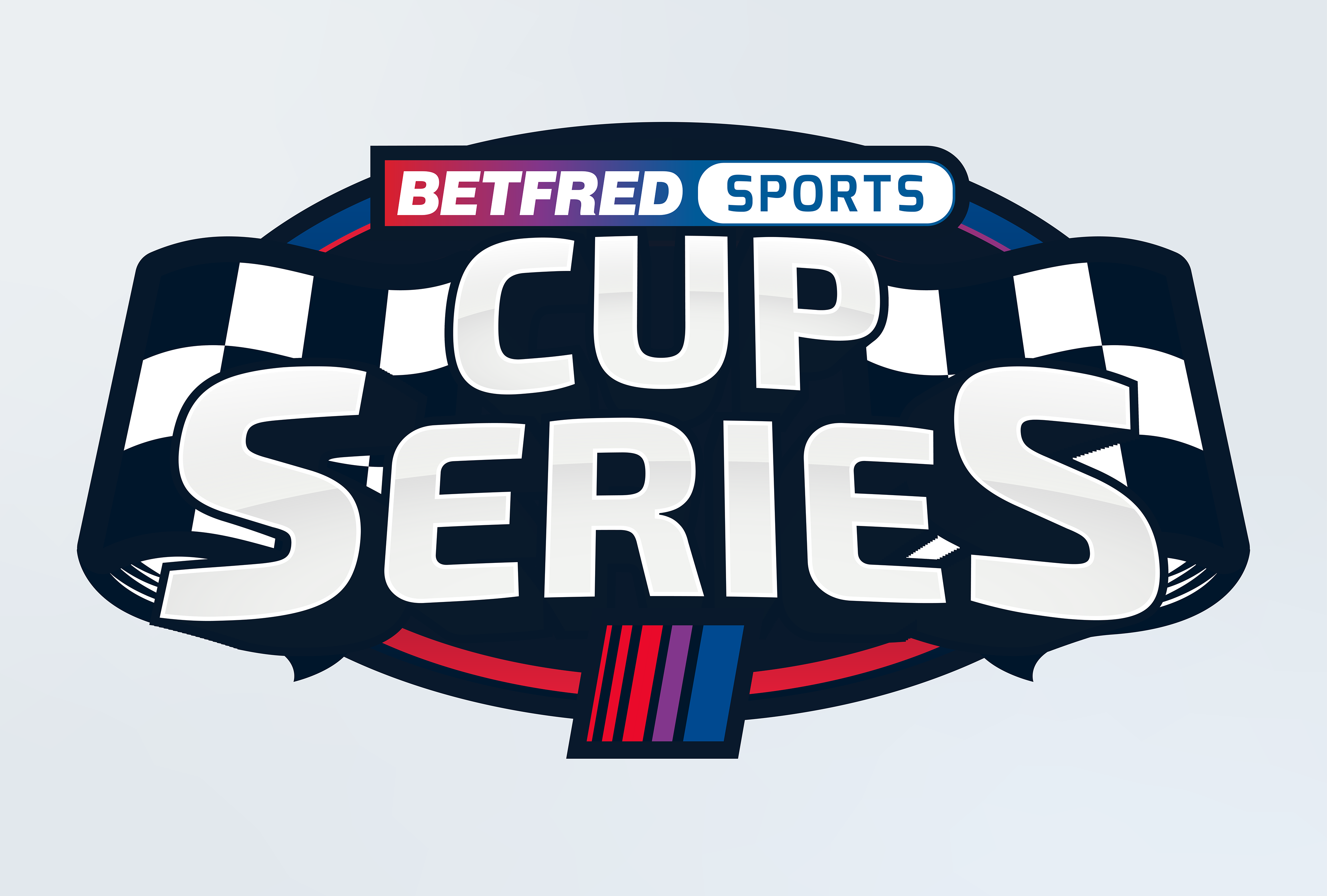
03 / Betfred Sports Cup Series Branding
Specialized Campaign Mark & Event Identity
The Betfred Sports Cup Series identity was engineered to anchor a targeted, high-stakes tournament promotion. The visual mark bridges traditional sports-book styling with dynamic racing aesthetics, utilizing custom angled typography and bold container line-work to convey a sense of high-velocity competition. The logo layout splits emphasis between core brand recognition ("Betfred Sports") and custom campaign messaging ("Cup Series"). This structured arrangement guarantees that the asset remains highly legible when scaled down for mobile application headers, web banners, or broadcast overlays.